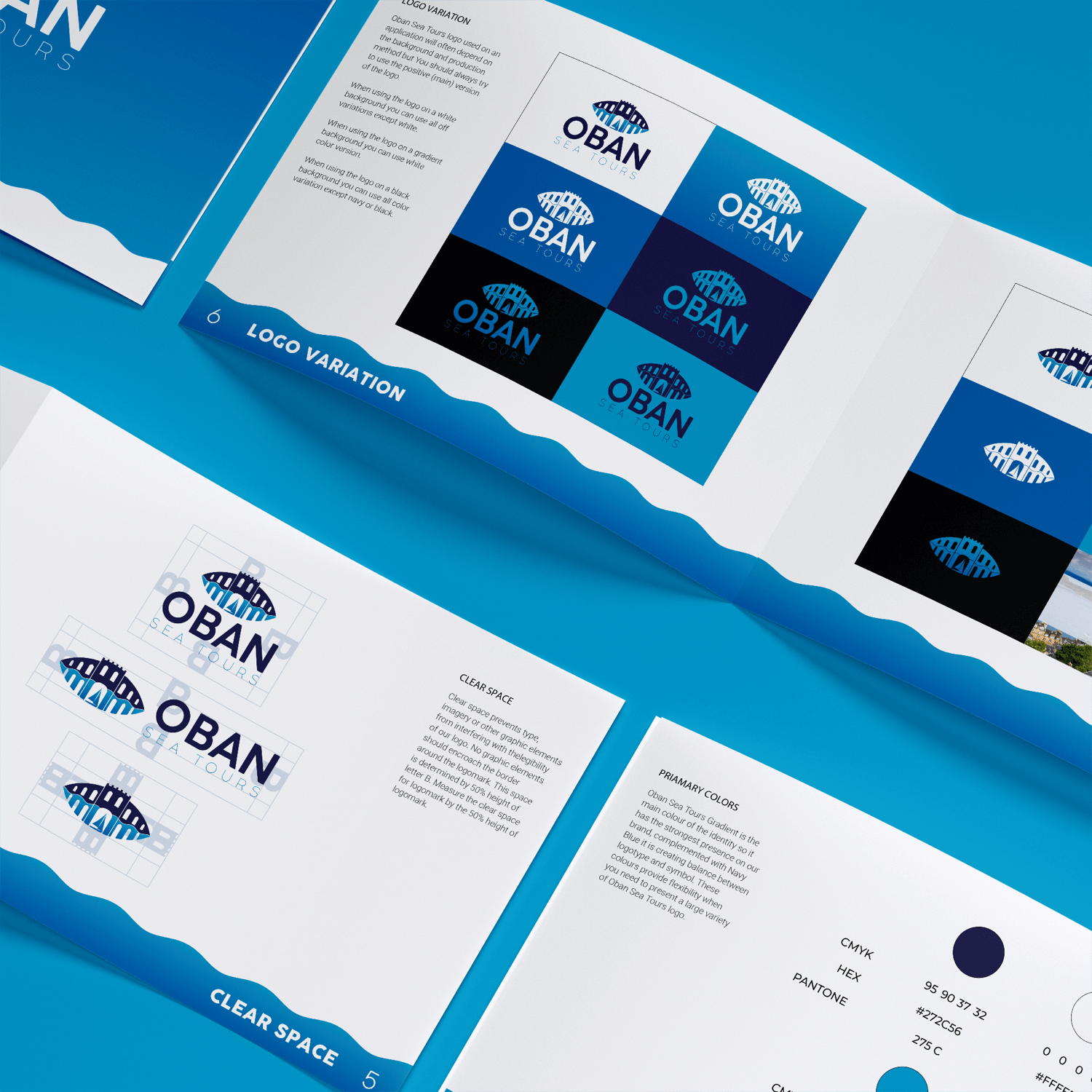
Creating a new brand from the ground up for Oban Sea Tours required extensive research and competitor analysis. This enabled us to develop logo concepts and a color scheme that would stand out among the many boat tour operations in the local area. Our design approach aimed to differentiate Oban Sea Tours from competitors while remaining true to the natural beauty and character of the region. The accompanying gallery showcases how the new brand can be applied across merchandise and signage to enhance visibility and promote the business.
The logo design for Oban Sea Tours features both a wordmark (logotype) and a figurative mark (symbol) in two variations—horizontal and vertical. The lettering is based on the Cocogoose typeface family, providing a modern yet nautical feel. The symbol incorporates McCaig’s Tower, a notable local landmark, with a sailboat positioned at the entrance, connecting the business to the iconic scenery of Oban. These logo variations were designed to function effectively across various platforms, including smaller devices and social media, ensuring consistent brand visibility across mobile applications and online platforms.
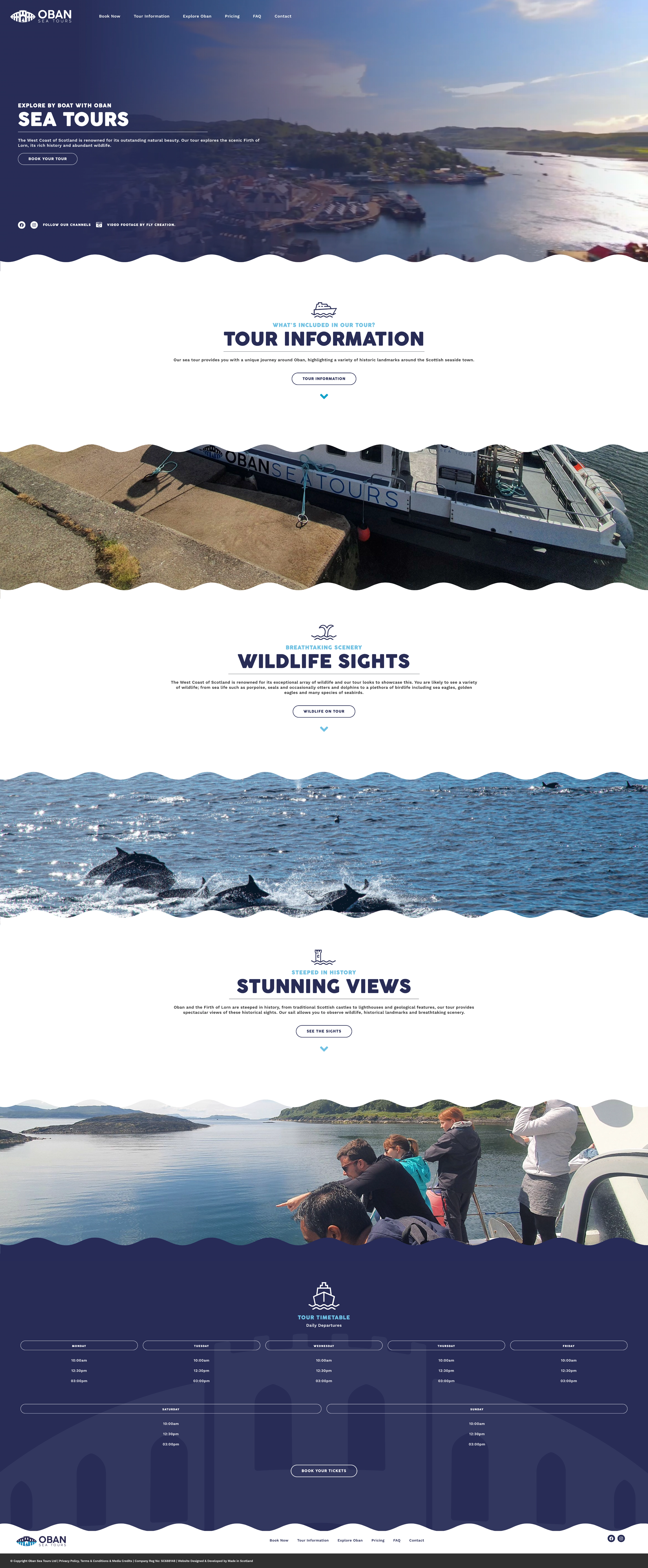
Oban Sea Tours aims to highlight the breathtaking local scenery, landmarks, and natural history along its tour routes. The website we developed leverages the client’s own stunning photography, showcasing wildlife and landscapes seen on boat tours and surrounding islands. We also integrated drone footage of the famous McCaig’s Tower, providing a captivating visual overview of Oban Harbour and its scenic surroundings. The website is seamlessly integrated with a third-party booking system to make managing tour reservations simple and efficient. In addition to booking functionality, the site includes sections for frequently asked questions, tour details, wildlife sightings, landmarks, and the company’s story, offering a complete user experience.

